Aurenament

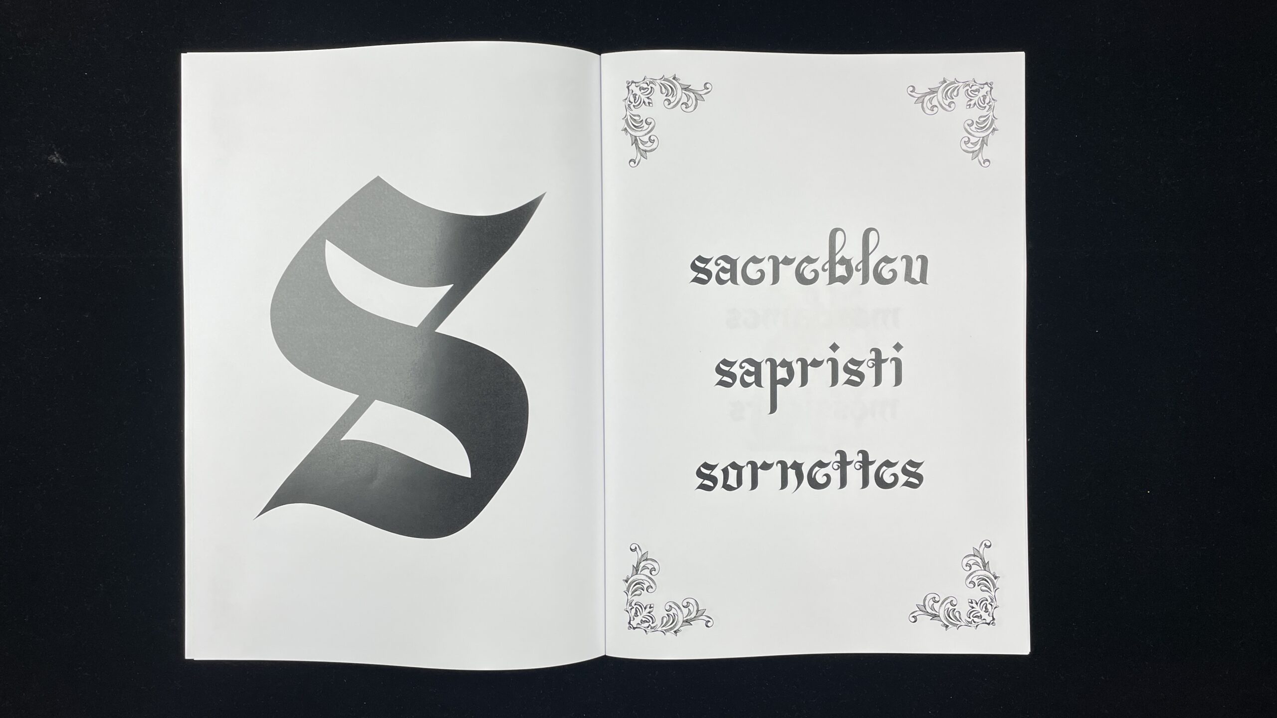
Aurenament is a typographic project that blends calligraphy and blackletter. The goal was to bring the manual and organic shapes of the calligraphy brush strokes and find a way to marry it with the more imposing and geometric nature of gothic type. The result is Aurenament. As the name suggests, it is an ornamental typeface made to be legible as a display font as well as in smaller, denser text.

DirTea

Commercial advertisement project for “DirTea” inspired by the bold and colourful Japanese beverage ads. Photography of the can with simulated condensation and studio lighting, editing in Lightroom and Photoshop, watercolour painting of peaches reworked as a background motif as well as the calligraphy of the Japanese text.

Magazine T

Creation of magazine covers for the “T – Le magazine du Temps” exploring a contemporary issue while respecting the existing style and visual identity of the magazine. This project explores generative art versus the classic masterpieces in the history of art they are based on. No artificial intelligence was used in the creation of this design. The images are existing ressources.

Paléo Festival 2026

Workshop in collaboration with the Base Design agency in Geneva to reimagine the visual identity for the 49th edition of the Paléo Festival (largest open-air festival in Switzerland) in 2026. Black card paper was cut, scanned and arranged to create a library of articulated dancers, representing the festival-goers. Making them an integral part of the visual design reflects their essential role in the Paléo Festival. This workshop also worked on creating the various digital and physical products and communication platforms for the festival. The design being modular allows the core concept to be adapted in a wide variety of ways to create merchandising products, animated screens of various formats, signage, and especially creating the official Paléo poster.

mm/yyyy

materials/softwares

personal/academic/fictional/real project, etc.

collab? → link to ig/website, etc.

type of design/domain

Yellow Border

Layout design of an academic article by Clémence Imbert called “Ce que l’histoire fait au graphisme”. Experimentation with a unique variable typeface, Salo Variable. Creation of a rigourous graphic element system from lines of varying widths to create dynamic rhythms and maintain a balance between text and form. Full article is a work in progress to be continued independently. A4 format, laser printed on high gloss 120gr/m² paper.